Chimera is a brand and packaging agency with decades of experience.
We work alongside our clients to distil their product’s point of difference into highly distinctive designs.
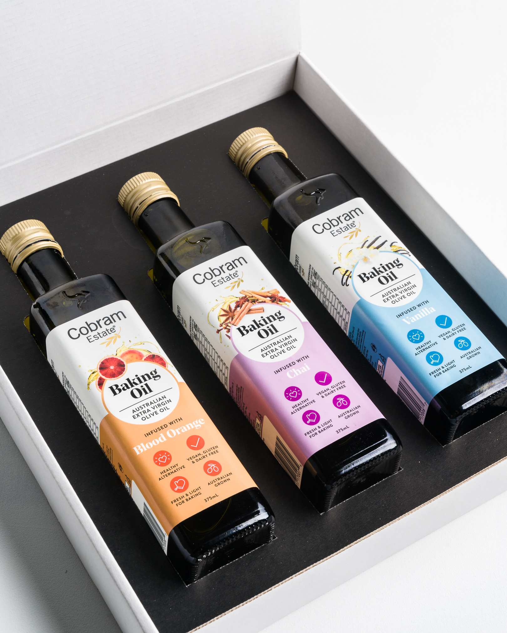
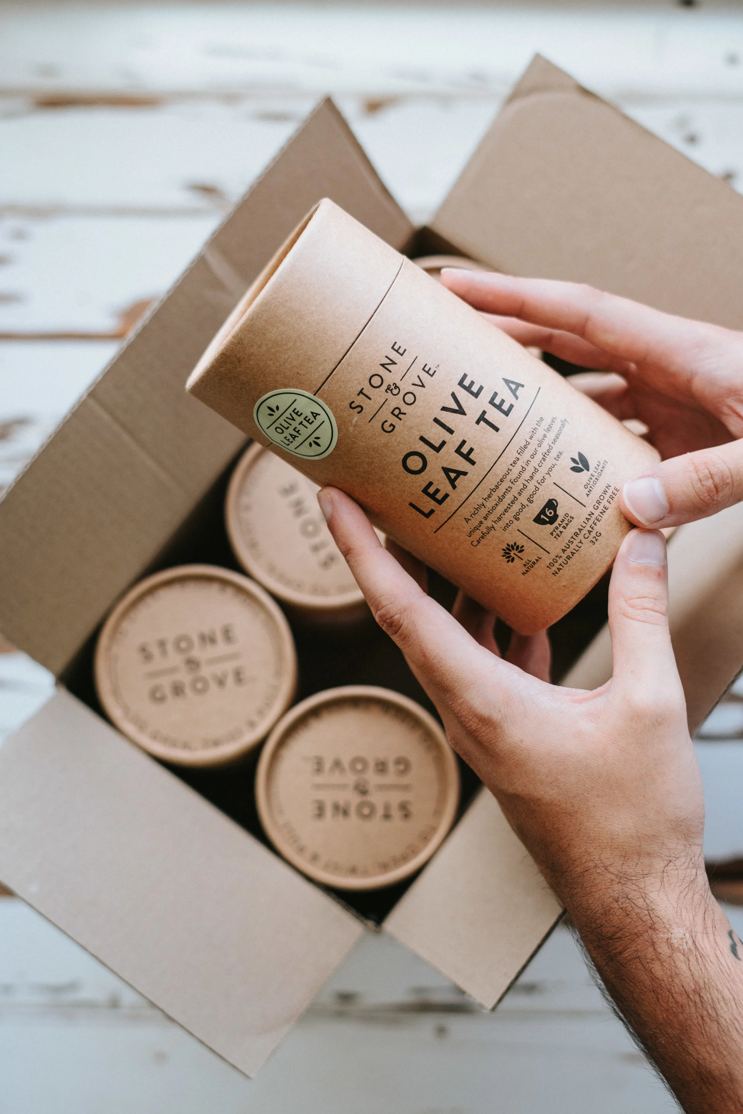
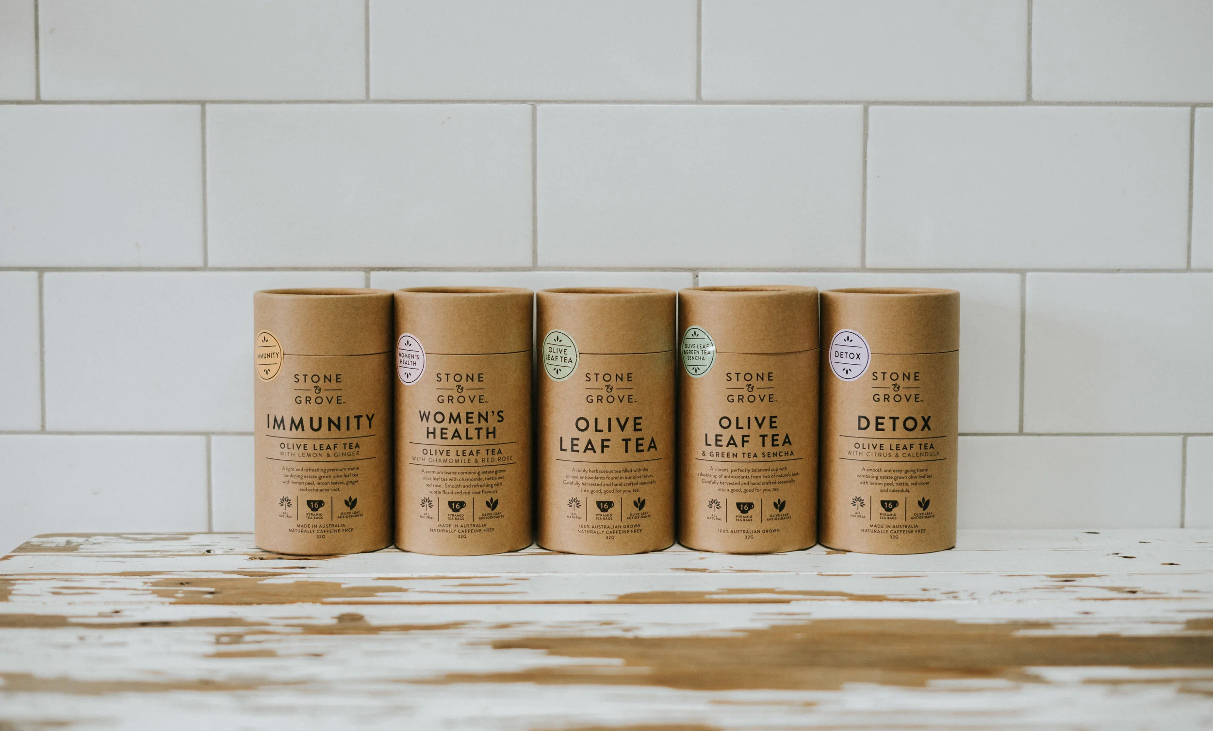
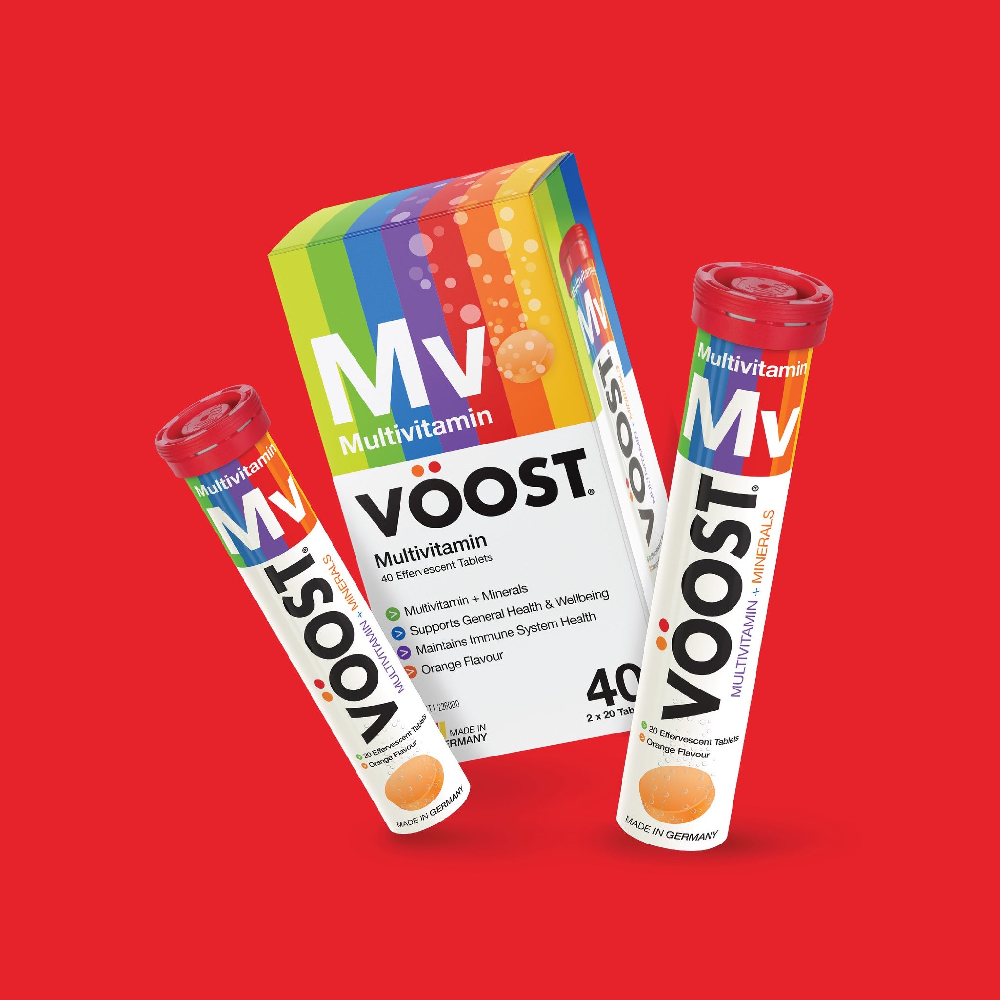
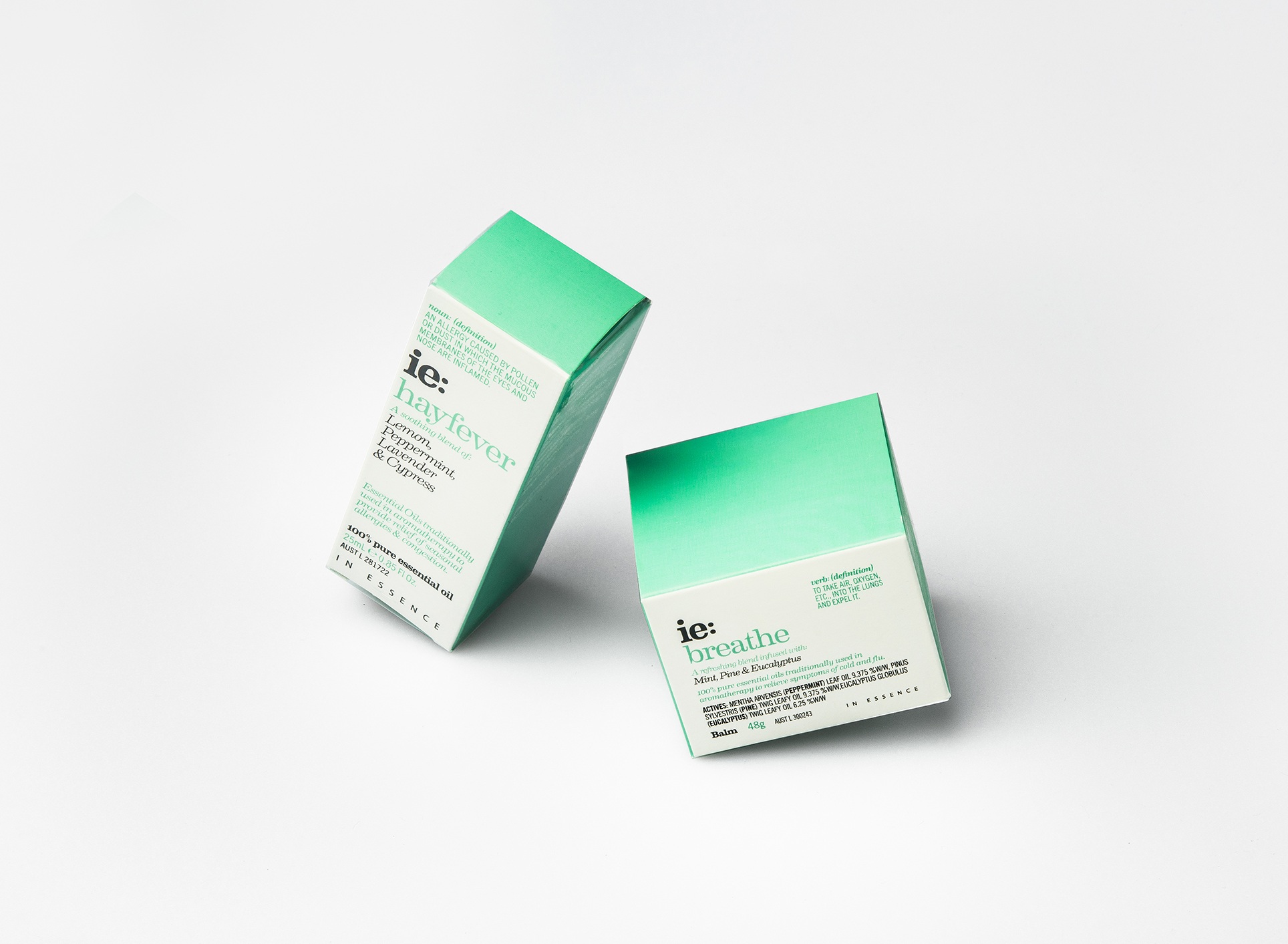
Our approach is based on close collaboration with our clients to create beautifully crafted packaging designs that work in the real world – be that on the competitive shelves of the supermarket, or on the top shelf of exclusive bars. We work with both established and emerging companies across a broad range of sectors including food and beverage, luxury alcohol, cosmetics, and pharmaceuticals.
We create, we communicate, we collaborate.